Long-Term Partnership

Branding

Social Media

App

Web Design

Michi Studio
Branding

We partnered with Michi Studio from day one to build a brand that could hold all of that. One that feels human, warm, and alive, and grows naturally as the business does.

ClientMichi Studio
Location Turkey

Contents

Project Overview

Michi Studio came to us as an idea before it was a brand. A small team with a clear vision, to build digital tools for personal growth, but no visual identity, no system, and no language to express what they stood for.

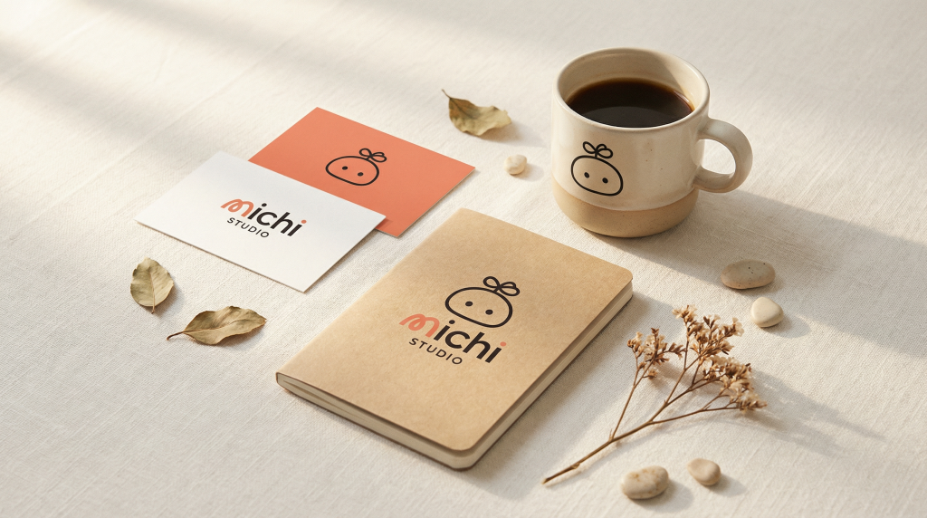
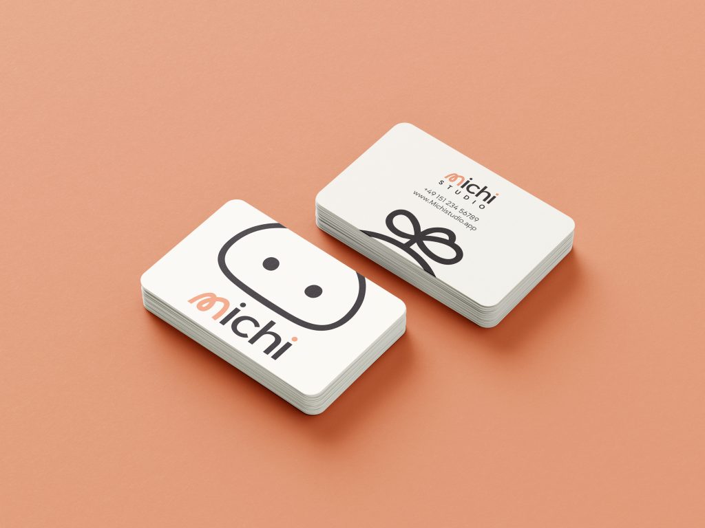
We partnered with Michi Studio from day one to build everything from scratch: brand strategy, visual identity, guidelines, web presence, app icons, print collateral, merchandise, and digital templates. The goal wasn’t just to make something beautiful. It was to build a brand that could grow in any direction the business decided to go.

About Michi

Michi (道) means “the way” in Japanese. Not a destination, a path. One filled with curiosity, reflection, and small intentional steps.

That philosophy shaped every decision we made. The brand needed to feel human and warm, but never naive. Simple, but never empty. Personal, but built to scale.

The Visual Identity

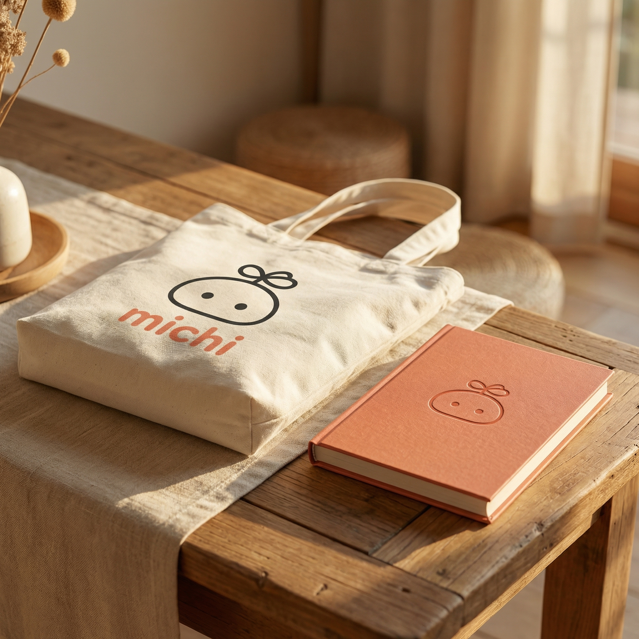
The mark combines a soft round character with a leaf topper that signals growth, and two small dots for eyes. Simple enough to be instantly recognizable. Expressive enough to carry real personality.

The custom “m” letterform in the wordmark was designed to echo the shape of a winding road, a quiet nod to the meaning of Michi itself.

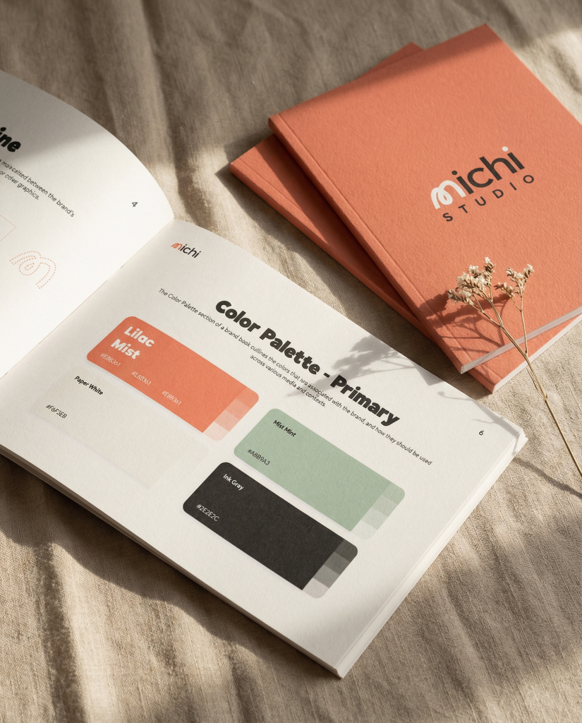
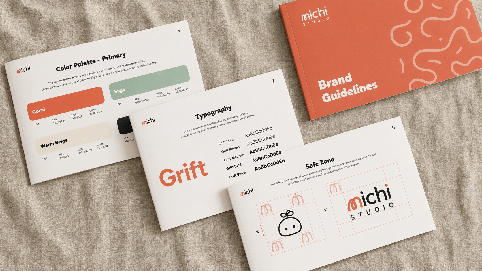
The palette is built around warmth and intention. Michi Coral as the primary, Mist Mint for balance, and Paper White as the canvas everything lives on. Typography is set in Grift, clean enough to disappear when needed, distinctive enough to hold the brand’s tone when it matters.
Typography System
Poppins - Grift

Aa

The quick brown fox jumps over

Grift

Weights: 300 – 800
Core Palette
Void
#050505
White
#F6F3EB
Mint
#A8B9A3
Coral
#E88361

Brand Guidelines

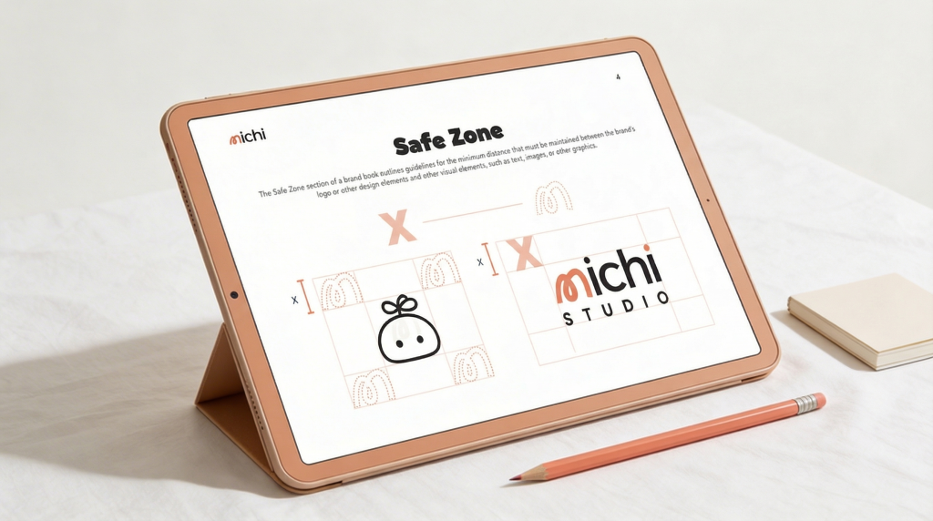
We documented everything: logo construction, color usage, typography hierarchy, character rules, and application examples. Built not as a rulebook, but as a toolkit. Something any designer or partner could pick up and get a consistent result without losing what makes the brand feel like Michi.

Digital Brand Assets

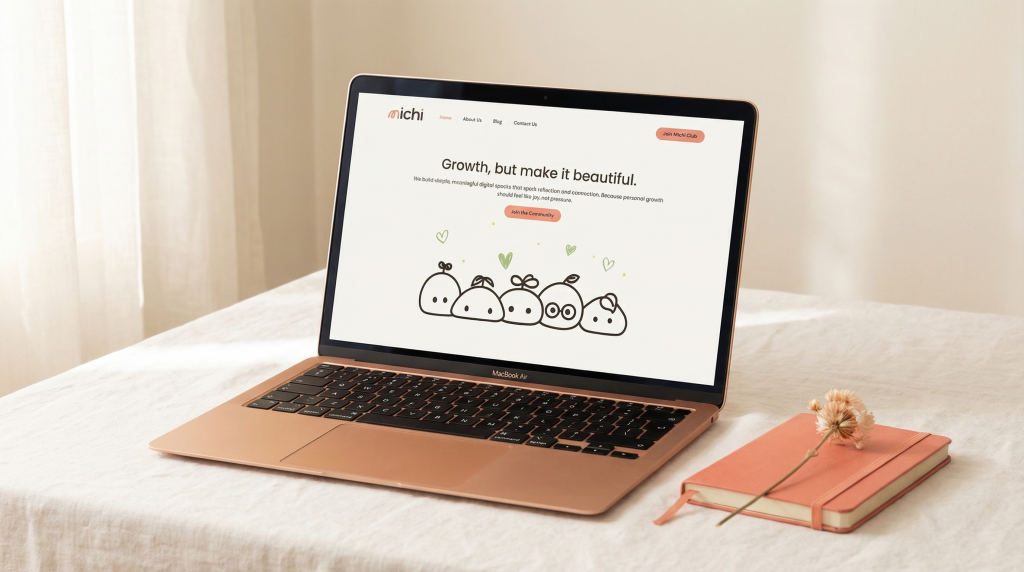
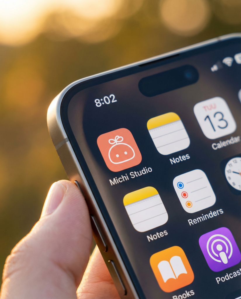
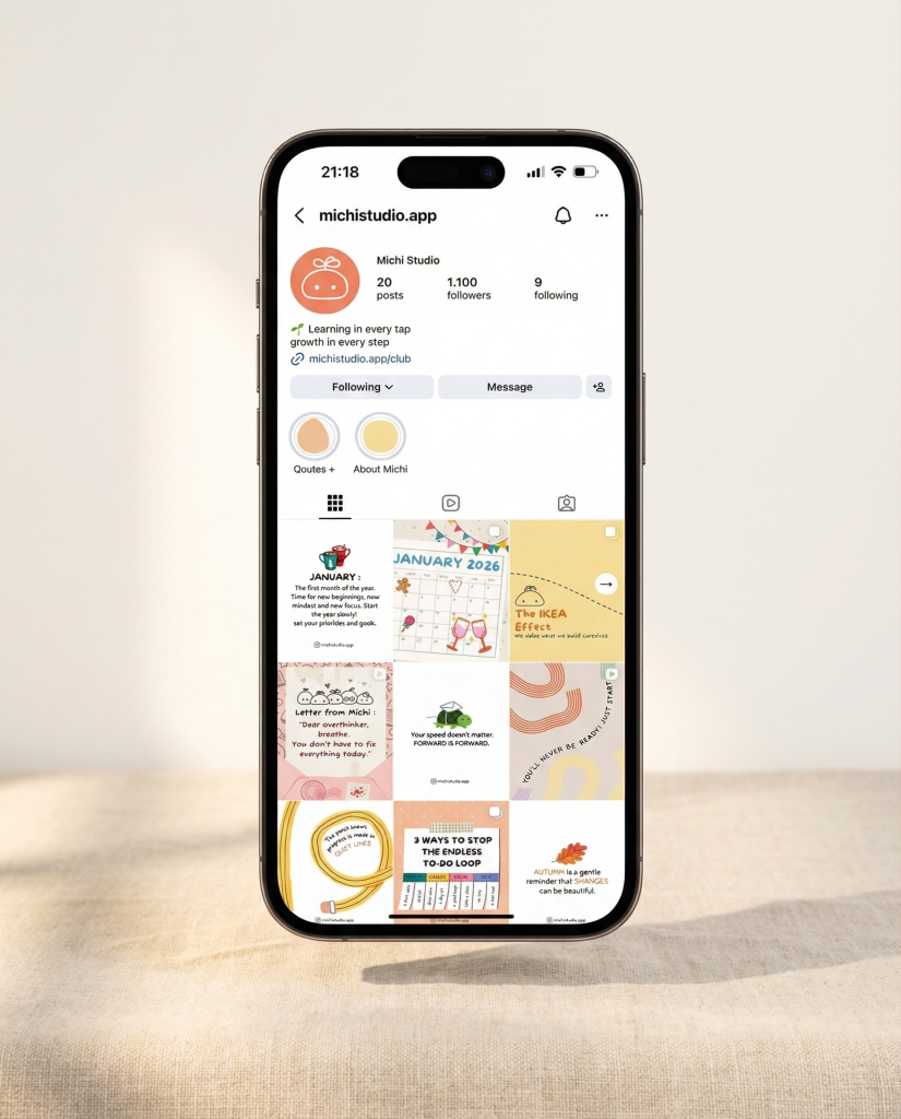
The website carries the brand’s warmth into every scroll. The app icon system was designed across multiple color variants, ready for new products as they launch. Social templates and the Instagram presence follow the same visual language, cohesive enough to be instantly recognizable, flexible enough to support a growing content strategy.

Where the brand came to life

Michi didn’t stay on screen. From handmade fabric badges to a live event in Istanbul, the identity found its way into the hands of real people, worn, held, and carried into everyday moments.

The Istanbul event was the first proof that Michi works in physical space. It won’t be the last. The brand was built for expansion, ready for new cities, new events, and new products without ever needing to start over.

The outcome

A Brand Built to Grow

The identity system is modular. New apps can live under it. New product lines can extend it. New markets can adapt it. What we built isn’t a snapshot of where Michi is today, it’s a foundation for wherever they decide to go next.

Growth, but make it beautiful.

michistudio.app

How would you prefer to connect?
Prefer to talk directly?
WhatsApp

Usually quick replies

Inquiry Form

Provide details for a custom proposal.